Show the code
# Weather data for Rexburg
rex_temp <- rio::import("https://byuistats.github.io/timeseries/data/rexburg_weather.csv")Eduardo Ramirez
# Weather data for Rexburg
rex_temp <- rio::import("https://byuistats.github.io/timeseries/data/rexburg_weather.csv")The first part of any time series analysis is context. You cannot properly analyze data without knowing what the data is measuring. Without context, the most simple features of data can be obscure and inscrutable. This homework assignment will center around the series below.
Please research the time series. In the spaces below, give the data collection process, unit of analysis, and meaning of each observation for the series.
Please plot the Rexburg Daily Temperature series choosing the range and frequency to illustrate the data in the most readable format. Use the appropriate axis labels, units, and captions.
This exercise will guide you through all the steps to conduct an additive decomposition of the Rexburg Daily Temperature Series. The first step is to aggregate the daily series to a monthly frequency to ease on the calculation. The code below accomplished the task.
# Weather data for Rexburg
monthly_tsibble <- rio::import("https://byuistats.github.io/timeseries/data/rexburg_weather.csv") |>
  # Convert 'dates' to Date format
  mutate(date2 = ymd(dates)) |>
  # Extract year and month from 'date2'
  mutate(year_month = yearmonth(date2)) |>
  # Group data by 'year_month'
  group_by(year_month) |>
  # Calculate mean of 'rexburg_airport_high' for each group
  summarize(average_daily_high_temp = mean(rexburg_airport_high)) |>
  # Remove grouping
  ungroup() |>
  # Convert data frame to time series tibble
  as_tsibble(index = year_month)

# Display the resulting tibble
#view(monthly_tsibble) # Doing m_hat & s_hat formulas & plotting m_hat
monthly_tsibble <- monthly_tsibble |>
mutate( # allows to do calculations - doing - m_hat & s_hat
m_hat = (
(1/2) * lag(average_daily_high_temp, 6)
+ lag(average_daily_high_temp, 5)
+ lag(average_daily_high_temp, 4)
+ lag(average_daily_high_temp, 3)
+ lag(average_daily_high_temp, 2)
+ lag(average_daily_high_temp, 1)
+ average_daily_high_temp
+ lead(average_daily_high_temp, 1)
+ lead(average_daily_high_temp, 2)
+ lead(average_daily_high_temp, 3)
+ lead(average_daily_high_temp, 4)
+ lead(average_daily_high_temp, 5)
+ (1/2) * lead(average_daily_high_temp, 6)
) / 12,
s_hat = average_daily_high_temp - m_hat # s_hat calculation
)
# Plot the CMA (centred moving average) and original data
plain_plot <- autoplot(monthly_tsibble, .vars = m_hat) +
labs(
x = "Date",
y = "Rexburg Monthly avg High",
title = "Rexburg Monthly CMA"
) +
scale_y_continuous(limits = c(min(monthly_tsibble$m_hat, na.rm = TRUE), max(monthly_tsibble$m_hat, na.rm = TRUE))) +
theme(plot.title = element_text(hjust = 0.5))
# Plot the original unemployment data with CMA overlay
fancy_plot <- autoplot(monthly_tsibble, .vars = average_daily_high_temp) +
labs(
x = "Date",
y = "Rexburg Monthly avg High",
title = "Rexburg Monthly CMA"
) +
geom_line(aes(x = year_month, y = m_hat), color = "#D55E00") +
theme(plot.title = element_text(hjust = 0.5))
# Combine the two plots
plain_plot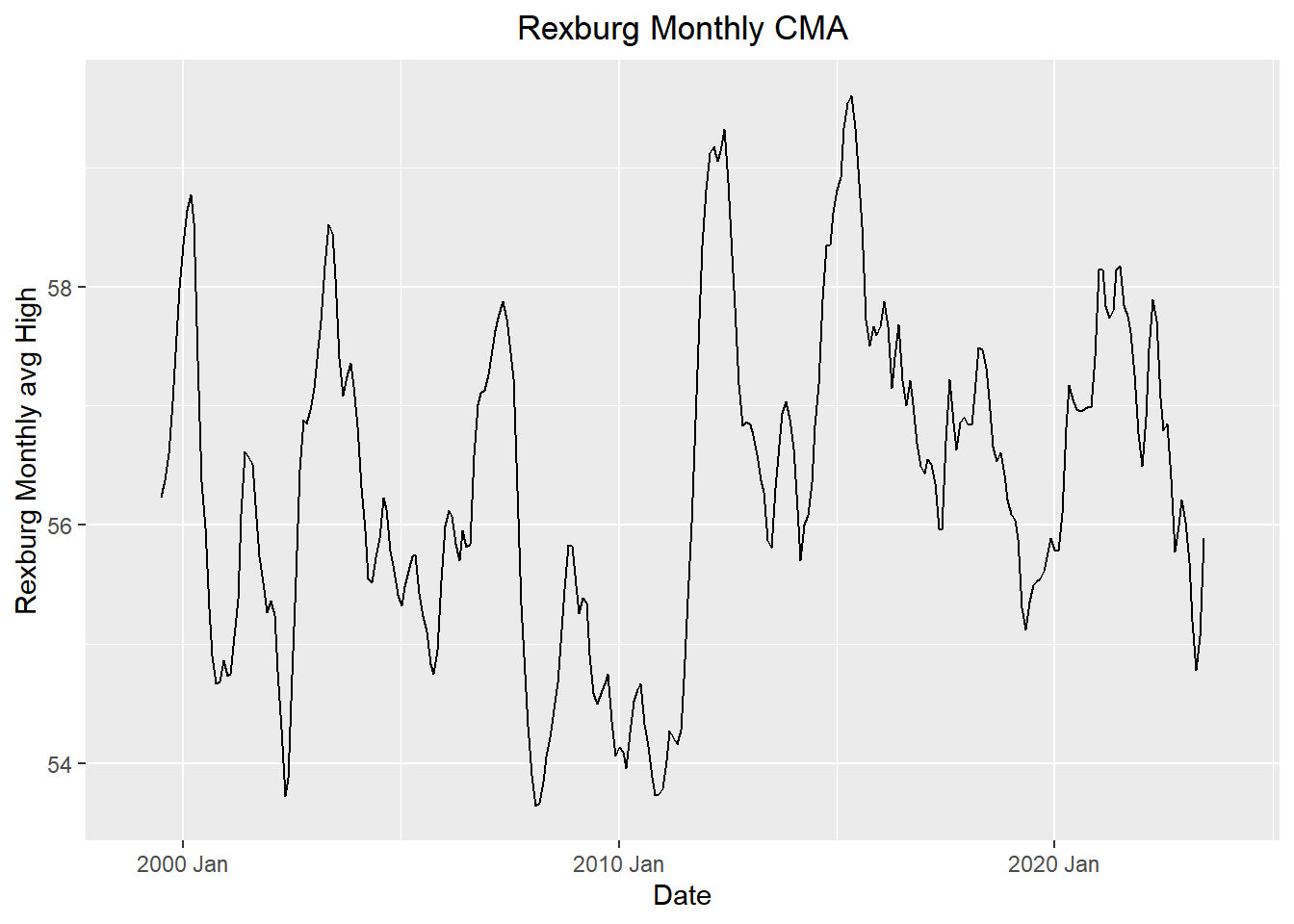
fancy_plot
In this just the monthly additive effect?
# Please provide your code here
# Extracting year and month from the year_month column
# adding s_bar manually do to joining errors
monthly_tsibble_extended <- monthly_tsibble %>%
  mutate(
    year = year(year_month),
    month = month(year_month),
    s_bar = case_when(
      month == 1  ~ -28.7455842,
      month == 2  ~ -24.7455412,
      month == 3  ~ -11.7605428,
      month == 4  ~ -0.4256582,
      month == 5  ~ 9.9075202,
      month == 6  ~ 19.4142229,
      month == 7  ~ 30.0205787,
      month == 8  ~ 28.1817736,
      month == 9  ~ 17.5450445,
      month == 10 ~ 1.6857404,
      month == 11 ~ -14.1466707,
      month == 12 ~ -26.9308833
    )
  )


# Initialize an empty list to store the sums for each month
monthly_averages <- vector("list", 12)

# Loop through months 1 to 12
for (month in 1:12) {
  # Calculate the sum of s_hat for each month and store in the list
  monthly_averages[[month]] <- (mean(monthly_tsibble_extended$s_hat[monthly_tsibble_extended$month == month], na.rm = TRUE))
}

# Optionally, you can convert the list to a named vector for clearer output
names(monthly_averages) <- month.name  # Assigning month names for clarity

# Calculate the overall mean of the unadjusted monthly additive component
overall_mean_of_the_unadjusted_monthly_additive_component <- sum(unlist(monthly_averages)) / 12

# Compute the seasonally adjusted mean for each month
seasonally_adjusted_mean <- sapply(monthly_averages, function(x) x - overall_mean_of_the_unadjusted_monthly_additive_component)

# Naming the results for the seasonally adjusted means for clarity
names(seasonally_adjusted_mean) <- month.name

# Display the overall mean and the seasonally adjusted means
overall_mean_of_the_unadjusted_monthly_additive_component
[1] -0.00853748# Create a data frame for the results
s_bar_df <- data.frame(
month = month.name,
s_hat_bar = unlist(monthly_averages),
s_bar = unlist(seasonally_adjusted_mean)
)
# formulas for random and seasonally adjusted x
adjusted_ts <- monthly_tsibble_extended |>
mutate(random = average_daily_high_temp - m_hat - s_bar) |>
mutate(seasonally_adjusted_x = average_daily_high_temp - s_bar)
# note difference between s_bar resuts
# the last mutate, seasonally_adjusted_x is the SEASONALLY ADJUSTED SERIES
# and just having the s_bar or seasonally_adjusted_mean (12 months only) is the SEASONALLY ADJUSTED MEANS plotting seasonally adjusted mean
# plotting seasonally adjusted mean
fancy_plot <- autoplot(adjusted_ts, .vars = seasonally_adjusted_x) +
  labs(
    x = "Date",
    y = "Seasonally Adjusted Mean",
    title = "Seasonally Adjusted Mean for Each Month"
  )
fancy_plot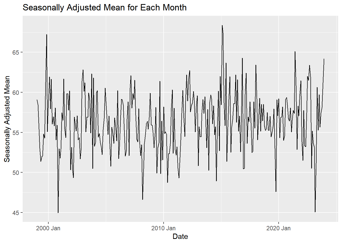
# the seasonally adjusted mean for each month refers to just the 12 months not the adjusted series. but not exact which one we should use.# Plot of the random component
fancy_plot <- autoplot(adjusted_ts, .vars = random) +
labs(
x = "Date",
y = "Random",
title = "Random Component"
)
fancy_plot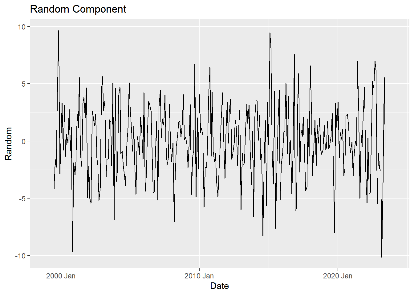
# Weather data for Rexburg
daily_tsibble <- rio::import("https://byuistats.github.io/timeseries/data/rexburg_weather.csv") |>
  mutate(year_month_day = ymd(dates)) |>  # Convert date strings to Date objects
  dplyr::select(-imputed, -dates) |>  # Remove 'imputed' and 'dates' columns
  as_tsibble(index = year_month_day)  # Convert the tibble to a tsibble with dates as the index

# Display the first few rows of the 'daily_tsibble'
daily_tsibble %>% head
# A tsibble: 6 x 2 [1D]
rexburg_airport_high year_month_day
<int> <date>
1 30 1999-01-02
2 25 1999-01-03
3 26 1999-01-04
4 29 1999-01-05
5 32 1999-01-06
6 31 1999-01-07 # Decompose the daily high temperature series into seasonal components
daily_decompose <- daily_tsibble |>
model(feasts::classical_decomposition(rexburg_airport_high ~ season(365.25),
type = "add")) |>
components()
# Plot the seasonal component of the decomposition
daily_decompose |> autoplot(.vars = seasonal)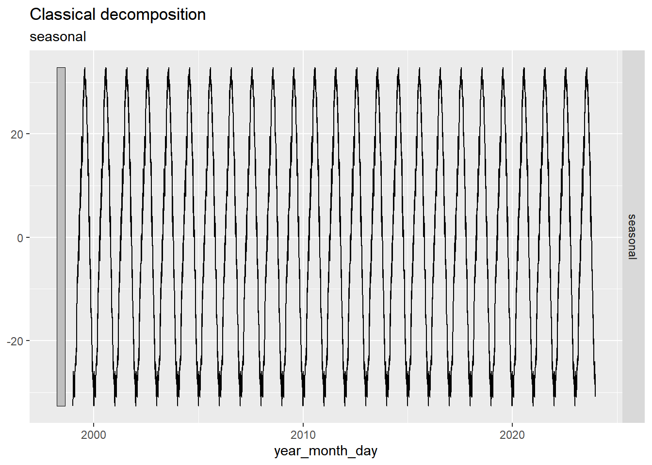
| Criteria | Mastery (10) | Incomplete (0) | |
| Question 1: Context and Measurement | The student thoroughly researches the data collection process, unit of analysis, and meaning of each observation for both the requested time series. Clear and comprehensive explanations are provided. | The student does not adequately research or provide information on the data collection process, unit of analysis, and meaning of each observation for the specified series. | |
| Mastery (5) | Incomplete (0) | ||
| Question 2: Visualization | Chooses a reasonable manual range for the Rexburg Daily Temperature series, providing a readable plot that captures the essential data trends. Creates a plot with accurate and clear axis labels, appropriate units, and a caption that enhances the understanding of the Rexburg Daily Temperature series. | Attempts manual range selection, but with significant issues impacting the readability of the plot. The chosen range may obscure important data trends, demonstrating a limited understanding of graphical representation.Fails to include, axis labels, units, or captions, leaving the visual representation and interpretation incomplete. | |
| Mastery (5) | Incomplete (0) | ||
| Question 3a: Monthly Aggregation | The code has been updated with comments and clear explanations of what each command and function does. The student shows they understand the intuition behind the procedure. | The code has not been updated or the comments and explanation do not provide enough evidence to prove the student understand the code. | |
| Mastery (5) | Incomplete (0) | ||
| Question 3b: Centered Moving Average | Correctly calculates the centered moving average. Clearly presents the results with well-labeled axes, titles, and a properly formatted plot. | Incorrectly calculates the centered moving average or omits it entirely. The plot is either missing or poorly presented, lacking clear labels, titles, or proper formatting, making it difficult to interpret the results. | | ||
| Mastery (10) | Incomplete (0) | ||
| Question 3c: Seasonally Adjusted Means Series | Correctly calculates the seasonally adjusted means series using an appropriate method. Produces a clear, accurate plot of the seasonally adjusted time series with well-labeled axes and titles. | Incorrect calculation or missing/incorrect plot. Plot lacks essential elements like labels, titles, or fails to represent the seasonally adjusted series. | | ||
| Mastery (5) | Incomplete (0) | ||
| Question 3d: Random Component Series | Correctly calculates the random component of the series by removing the trend and seasonal components. Produces a clear, accurate plot with well-labeled axes, titles, and proper formatting. | Incorrectly calculates the random component, omits steps (e.g., does not remove trend/seasonality), or the plot is unclear or missing essential elements like labels and titles. | |
| Mastery (10) | Incomplete (0) | ||
| Question 4a: Decompose Monthly | Correctly applies the additive decomposition model to the Rexburg Monthly Temperature Series. Clearly presents the trend, seasonal, and random components in well-labeled plots, with appropriate titles, axes labels, and formatting. | Fails to correctly apply the additive decomposition model, resulting in incorrect or incomplete separation of the trend, seasonal, and random components. The plot is either missing or poorly presented, lacking proper labels, titles, or clear distinction between components. |
|
| Mastery (5) | Incomplete (0) | ||
| Question 4b: Decompose Daily | The code has been updated with comments and clear explanations of what each command and function does. The student shows they understand the intuition behind the procedure. | The code has not been updated or the comments and explanation do not provide enough evidence to prove the student understand the code. | |
| Mastery (10) | Incomplete (0) | ||
| Question 5a: Modeling Justification | Clearly differentiates between the multiplicative and additive model assumptions, and shows how the series best matches the additive model’s assumptions. | It’s not clear that the student understands the difference between the additive and multiplicative model or their assumptions. | |
| Mastery (10) | Incomplete (0) | ||
| Question 5b: Random Component Analysis | Compares the random components derived from three different procedures, accurately stating whether they are the same or different. Identifies and explains any observed similarities or differences. Proposes a logical, well-reasoned explanation for why similar patterns might exist in the random components, using relevant time series concepts (e.g., common noise factors, model assumptions). | Fails to correctly compare the random components, or provides an unclear or inaccurate comparison. | Fails to provide a clear or accurate explanation for the commonalities, or provides irrelevant reasoning. | |
||
| Total Points | 75 |